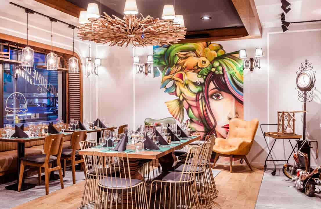
Mimarlık ofisi: GörkemVolkanDesignStudio
İşveren: Modern Et A.Ş.
Proje yeri: Zürih, İsviçre
Proje tipi: Restoran
Proje yılı: 2018
Web sitesi: www.gvds.com.tr
ENDI BURGER HOUSE
Proje Künyesi / Metni
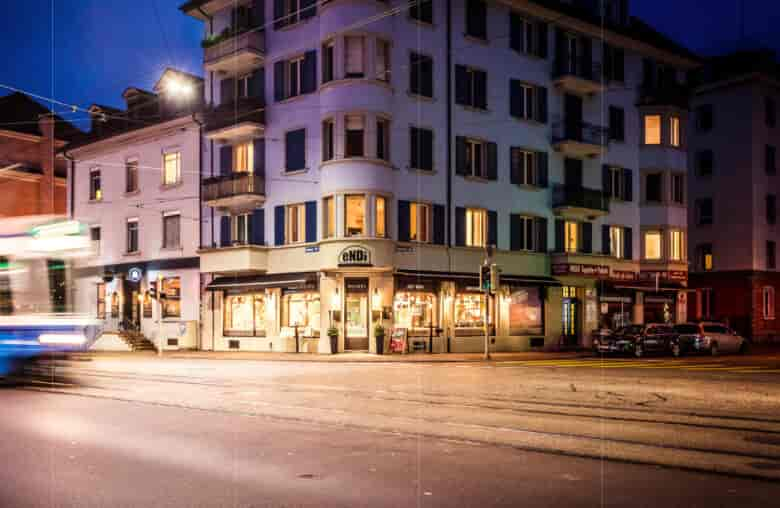
Endi Burger House is located in the heart of the Zurich, Switzerland.
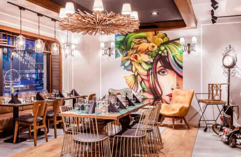
The new architectural concept for Endi Burger House restaurant was created by GVDS in response to the company’s desire to define the identity of the general fast food venues that have established it as a recognized brand name in the Swiss market. The proposed space, with its warm and intimate environment, recalls the joy of a communal kitchen where family and friends share the table and the joyful memories of a garden barbecue or a picnic in the countryside.
A key element of differentiation in this most recent venue of the brand was the decision to push inwards the boundary of the interior space. Furthermore, the Endi Burger House Concept is enriched with the addition of certain new cladding materials, as well as decorative elements that combine graphics with lighting and incandescent lamps, giving them a three-dimensional and vibrant effect. Custom designed furniture, such as brownish booths reminiscent of the old times train locomotive seating furniture, create interesting relaxing corners for small or larger parties. The restaurant gets a more youthful and contemporary vibe while maintaining the warm and friendly atmosphere that characterizes the new identity of Endi Burger House.
The design is simple, modern and attractive, and at the same time clear and communicative. In all over the design elements GVDS used simple natural materials and bright colors typical of the city style, in Zurich.
A centrally located open bar becomes the prominent spatial element and the kitchen is visible to customers, while several signboards and panels are scattered throughout the area showing the gastronomic products offered and the relative prices.
The choice of colors has followed a careful market analysis aimed to internationalization of the project, in line with international trends. Colours like green tiles and dark grey and parquet mixed floor generate the right contrast. This contrast is marked by the presence of wooden frames separating the two types of materials. Stools and tables have a retro design and are made entirely of metal coated on top of wood. The counter has wood paneling which supports a plan that follows the side of the unit. Additional details include a graffiti-style mural covering one wall, and specked white lampshades adorning the pendant lamps and sconces. In addition, all the furnishings were designed by GVDS.
